
Modern Web Responsive Solutions
Web Responsive Services Tailored to Your Needs
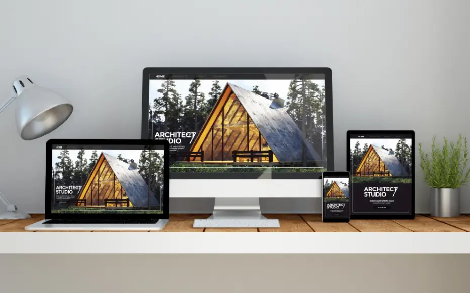
In today’s digital age, having a responsive website is essential for reaching your audience on any device. At SMK NexTech, we specialize in creating dynamic, mobile-friendly websites that adapt perfectly to screens of all sizes. Our services are designed to improve user experience, boost engagement, and increase conversions.
Why Choose Our Web Responsive Services?
- Seamless User Experience: Ensure your website looks and performs flawlessly on desktops, tablets, and smartphones.
- Improved SEO Performance: Responsive designs are favored by search engines, helping you rank higher and attract more organic traffic.
- Faster Load Times: Optimized layouts and performance for quick loading, keeping visitors engaged.
- Future-Proof Design: Built with scalability in mind to accommodate new devices and screen resolutions.
Our Approach to Responsive Design
-
Custom Design Solutions
We craft bespoke responsive layouts tailored to your brand and business goals. -
Mobile-First Strategy
With mobile usage on the rise, we prioritize creating a robust mobile experience first. -
Cross-Browser Compatibility
Your website will perform consistently across all major browsers and platforms. -
Testing and Optimization
Rigorous testing ensures a flawless user experience on every device and screen size.
Industries We Serve
We provide web responsive services across a variety of industries, including:
- E-commerce
- Healthcare
- Education
- Real Estate
- Small Businesses and Startups
Ready to Make Your Website Responsive?
Transform your online presence with SMK NexTech's web responsive services. Contact us today to discuss your project and let’s create a website that stands out in today’s competitive digital landscape.